I’m willing to bet that you’ve seen a map of the Earth before.
But I doubt that you’ve seen this one.
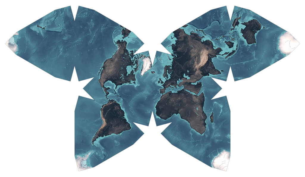
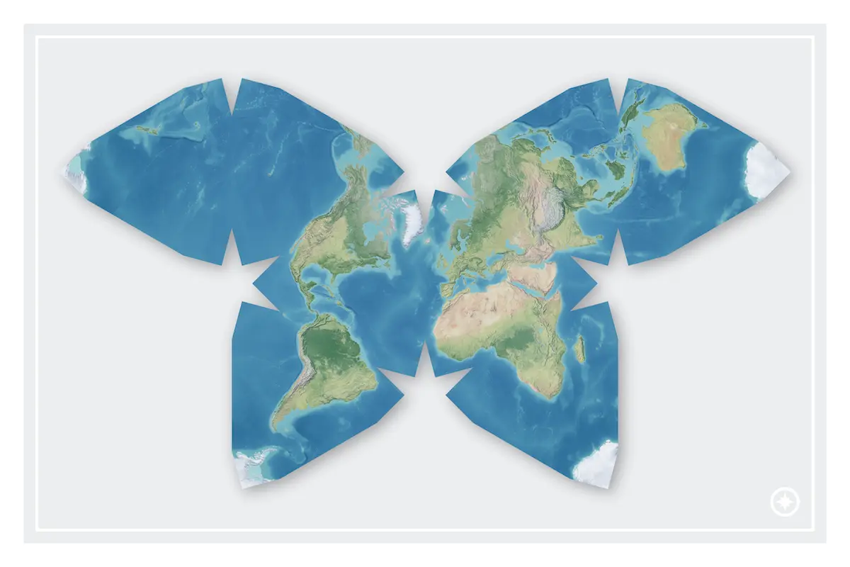
This is the Waterman Butterfly, a map projection invented by the mathematician Steve Waterman.
In my experience, most people’s first reaction upon seeing the Waterman is “Wow, that’s so pretty!”, followed by “Wow, what a goofy and impractical map!”
However, I think that the Waterman has some genuine advantages over many map projections. It’s definitely not perfect, but it’s much more useful than it might appear at first glance.
All map projections are wrong
First, a bit of background information. Because the Earth is a 3D sphere and maps are 2D images, if you want to display the Earth’s surface onto a map, you need to do some mathematics to convert it. Critically, this conversion always sacrifices something. It’s mathematically impossible to make a perfect map projection, so you have to consider the trade-offs and choose what’s most important to preserve and what you’re willing to sacrifice.
Mercator’s infamous Greenland distortion is a good example. On a Mercator map, Greenland looks to be about the same size as Africa. In reality, if you were to start counting acres, you would find that Greenland is 14x smaller than Africa, and in fact has less area than the DRC alone. The reason that Greenland looks so huge on the Mercator projection is that the Mercator represents angles perfectly, which comes at the cost of accurately representing area. The Mercator projection severely distorts the area of landmasses further from the equator, and because Greenland is far away from the equator, it appears far larger than it really is.
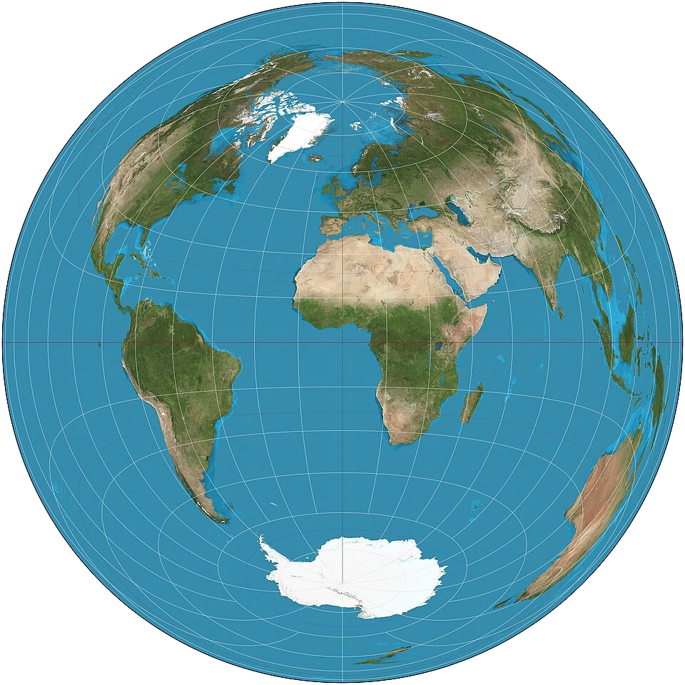
The opposite of the Mercator is the Lambert azimuthal projection, which perfectly represents area at the cost of horribly misrepresenting angles. The further from the center you go, the more distorted everything looks. For example, look at Australia in the image below. Even though its area is perfectly represented, its shape is so distorted that it’s almost unrecognizable.
Map design isn’t about creating the “perfect” map projection for all use cases, just like how car design isn’t about creating the “perfect” car that works equally well for daily commutes, racing, and long-haul trucking. Variety is important so that the right projection can be used for the right map.
If you’re a 16th-century sailor with only a compass, a Mercator map makes navigation pretty easy. If you’re the United Nations trying to decide on a flag that represents all countries equally, an azimuthal map is pretty diplomatic.
That being said, some projections are better than others.
Advantages of the Waterman
Accuracy
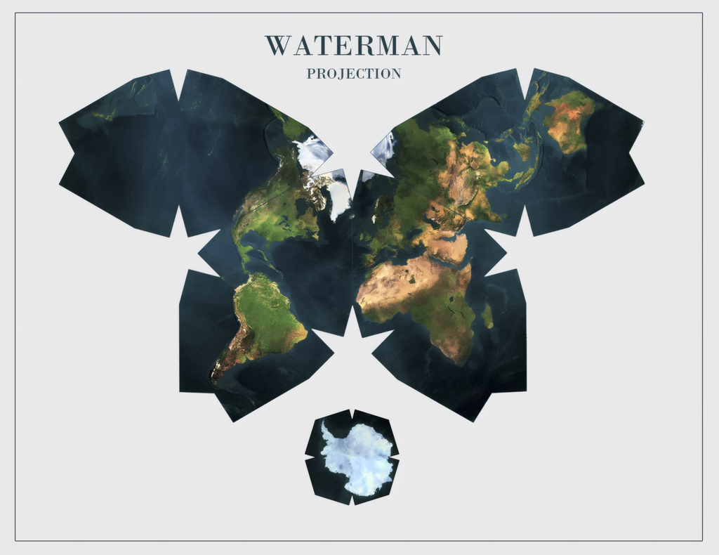
The Waterman is one of the most accurate map projections. Full stop. It doesn’t perfectly preserve either area or angles, but it compromises between them to achieve one of the lowest distortion ratios of any known map projection. The maximum angle distortion on the Waterman is about 20° and the maximum area distortion is about 10%.
To put that into perspective, let’s compare the area distortion of the Waterman to that of the Mercator. The amount that the Mercator projection distorts area is unbounded (meaning at the exact north pole, the area distortion approaches infinity), but usually people crop the Mercator projection to only show 85° of latitude or less. At 85°, the Mercator projection distorts land by 13,165%. Yes, really. It’s a distortion factor of 131x. Even if you crop it to 45° of latitude (meaning you couldn’t see anything above Southern France), the Mercator projection still distorts area by a factor of 2x. The Waterman’s 10% area distortion is practically negligible in comparison.
Unintuitiveness
Strange as it sounds, you don’t want a map to seem intuitive. Map projections that project the Earth onto everyday 2D shapes like circles and rectangles tend to make people think that they understand the geometry better than they actually do.
For example, if I were to ask you “what’s the shortest path between two points on a 2D rectangle”, you would probably respond with the correct answer: “a straight line between those two points”. So it follows that if I were to ask you “what’s the shortest path between two points on a map shaped like a 2D rectangle”, you would respond “a straight line between those two points”. But you would be wrong.
To demonstrate, I made this image of two routes between Stonehenge (Salisbury, England) and Stonehenge (Odessa, Texas), displayed on the Mercator projection.
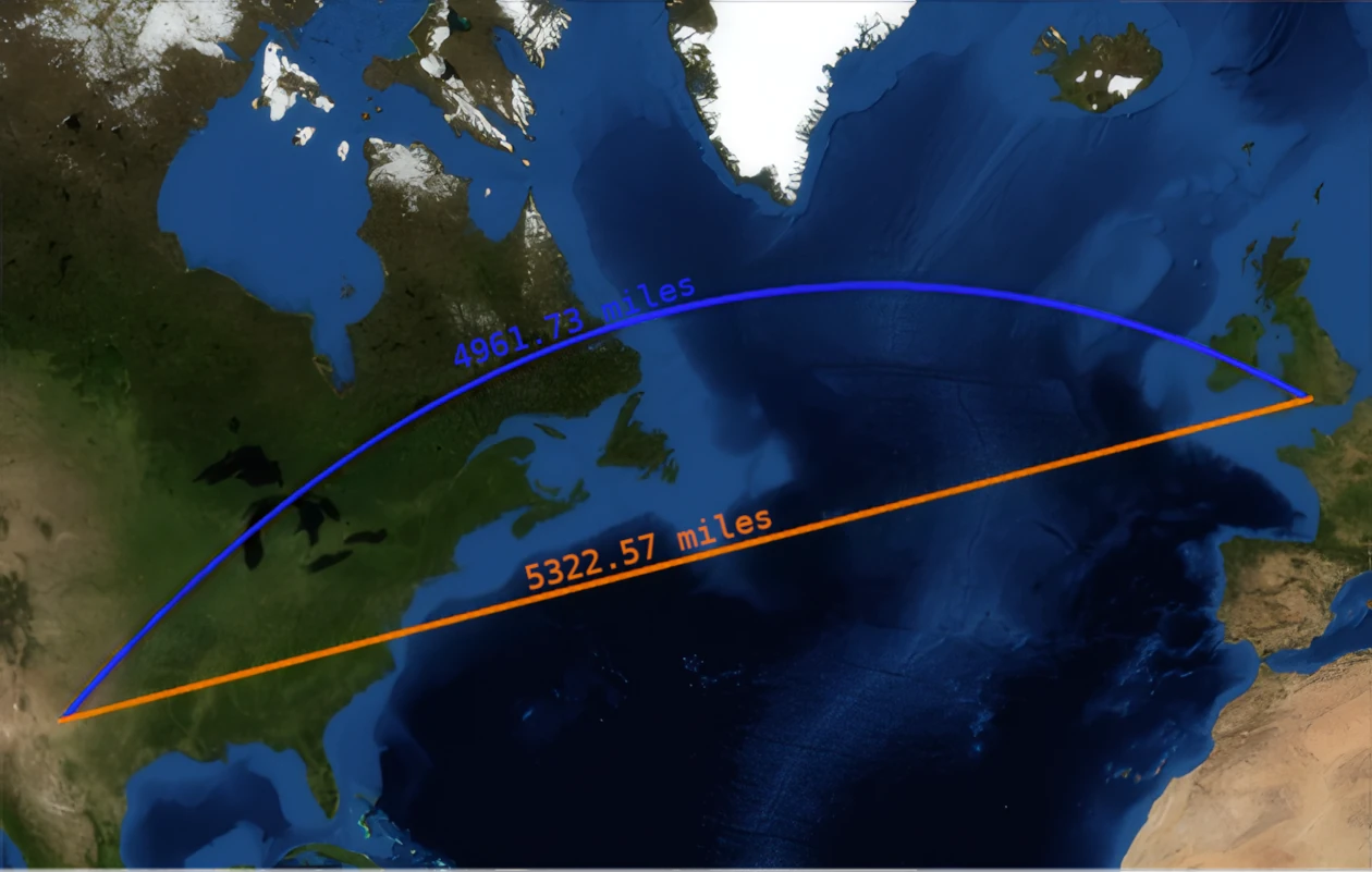
Intuitively, the orange route looks to be the shortest. On a rectangle, straight lines are always the shortest, and the map is a rectangle. Ipso facto, the straight line route is the shortest. And yet, if you were to actually travel these routes, you’d find that the although the orange route is 5322.57 miles, the blue route is only 4961.73 miles (source). Even though the blue route appears curved and indirect on the map, it’s significantly shorter.
This is because the blue route is an example of a great circle route: by definition the shortest possible route between two points on a sphere. Because the Earth is a sphere, the blue route is the shortest possible route. It only looks curved and inefficient as a result of Mercator distortion.
Rectangular maps lull people into a false sense of understanding. People understand how rectangles work, so they assume that rectangular maps work the same way, even though they don’t. The Waterman solves this problem by being a butterfly. Most people don’t have an intuitive understanding of the geometry of butterflies, so people are mistrustful of its geometry and less likely to make false assumptions.
Aesthetics
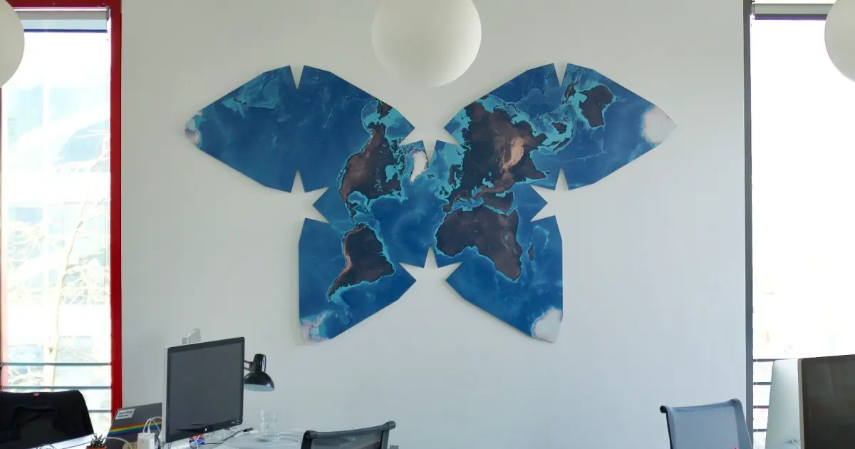
The Waterman is an objectively beautiful map.
Of course, beauty is subjective, but it isn’t that subjective. Humans almost universally appreciate symmetry, and the Waterman not only has perfect vertical symmetry, but it’s composed of four symmetric pairs of equilateral triangles; triangles which themselves have horizontal, vertical, and rotational symmetry. The Waterman has 4 stars in the negative space of each vertex of the central rhombus (which has geometrically-pleasing proportions of 1:√3), one of which forms leading lines towards the North pole. There’s tons of geometric elegance in the Waterman that makes it visually striking and pleasing to look at.
Beyond geometry, there’s also symbolism. The Waterman is in the shape of a butterfly: a symbol of wildness and nature and exploration. Rather than conforming to a standardized rectangle or circle, the Waterman’s form is unique and striking, which is befitting of a depiction of the one and only Earth.
While the Waterman’s accuracy and unintuitiveness makes it a useful pedagogical tool, its visual elegance makes it useful for decoration. Putting a Mercator map or a Robinson map in a hallway evokes a theme of either a schoolroom or a sailor’s cabin, neither of which are usually desirable for your home or office or whatever. The Waterman evokes a completely different theme: one of simultaneous classical elegance and sleek modernity.
I also have anecdotal evidence: I’ve shown the Waterman to a lot of people over the years, and I’ve never once encountered someone who actively disliked the aesthetics (though lots of people had critiques on the practicality).
The Waterman is one of the most beautiful ways to view the Earth.
Problems with the Waterman
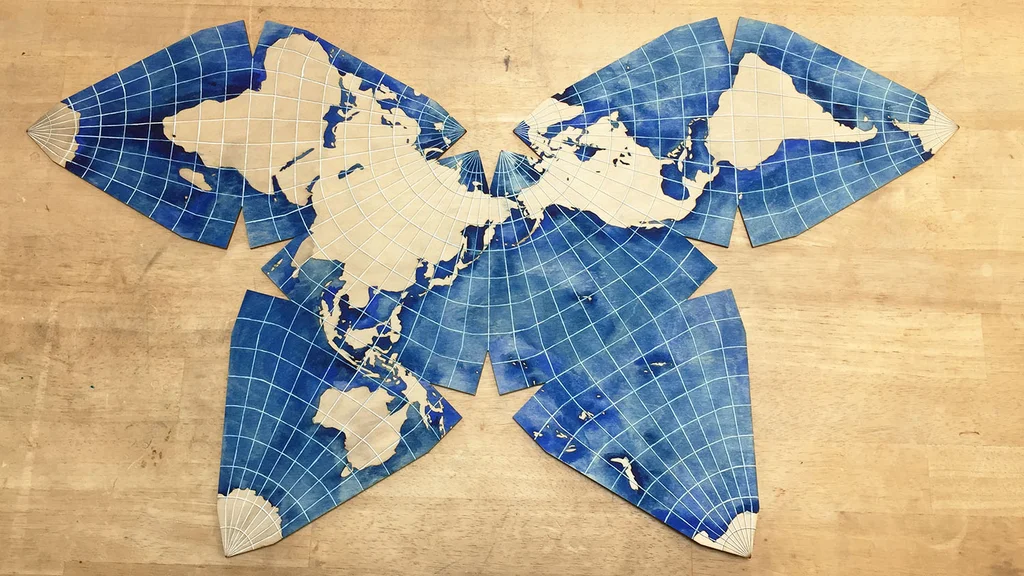
Discontinuity
Remember when I said that all map projections have to sacrifice something? The main thing that the Waterman sacrifices is continuity.
Most maps are one solid shape that loops around on the edges (exception: globes). The only time that you would “teleport” on a Mercator map is if you crossed the 180th meridian or one of the North or South poles. On a Waterman map, there are lots of places that you would teleport. For example, the equator on a Waterman map is broken into four discontinuous lines. I’ve highlighted them in red in the image below.
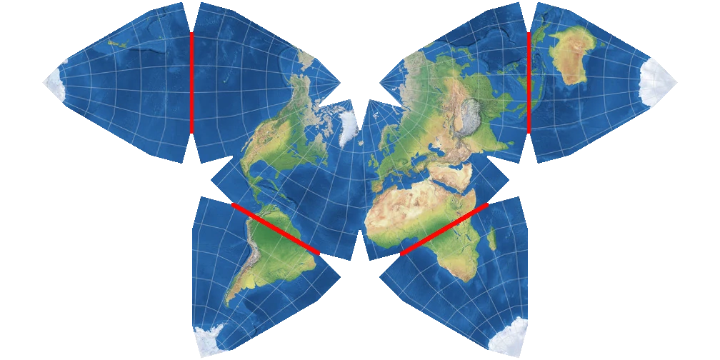
If you were to travel along the equator and watch your progress on a Waterman map, you would notice that once you reached the end of one equator segment, you would appear to suddenly teleport over 5000 kilometers. On most maps, this doesn’t happen (though there are a few exceptions).
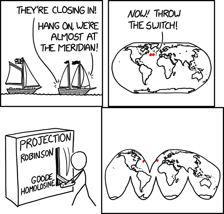
The Waterman has much more “teleportation” than most other maps, which can be confusing, especially because it’s not always immediately obvious where you’ll end up if you cross a discontinuity.
Relative North
On most common maps like the Mercator or the Robinson, North is always up. All ‘up’ things are ‘north’, and vice versa. The two directions are equivalent.
But on the Waterman, ‘north’ no longer always means ‘up’. Instead, north varies by location. In North America, north is to the upper right, but in Europe, north is to the upper left. In Australia, north is to the left and slightly down. Iceland is the only landmass on the Waterman where north is directly upwards.
This can be disorienting and takes quite a bit of getting used to. It also makes it much more difficult to describe locations in relation to the cardinal directions.
Bonus: how the Waterman works
The Waterman projection is one of the uses Steven Waterman found for his Waterman Polyhedra. The mathematics is a bit advanced, but I’ll do my best to ELI5 it.
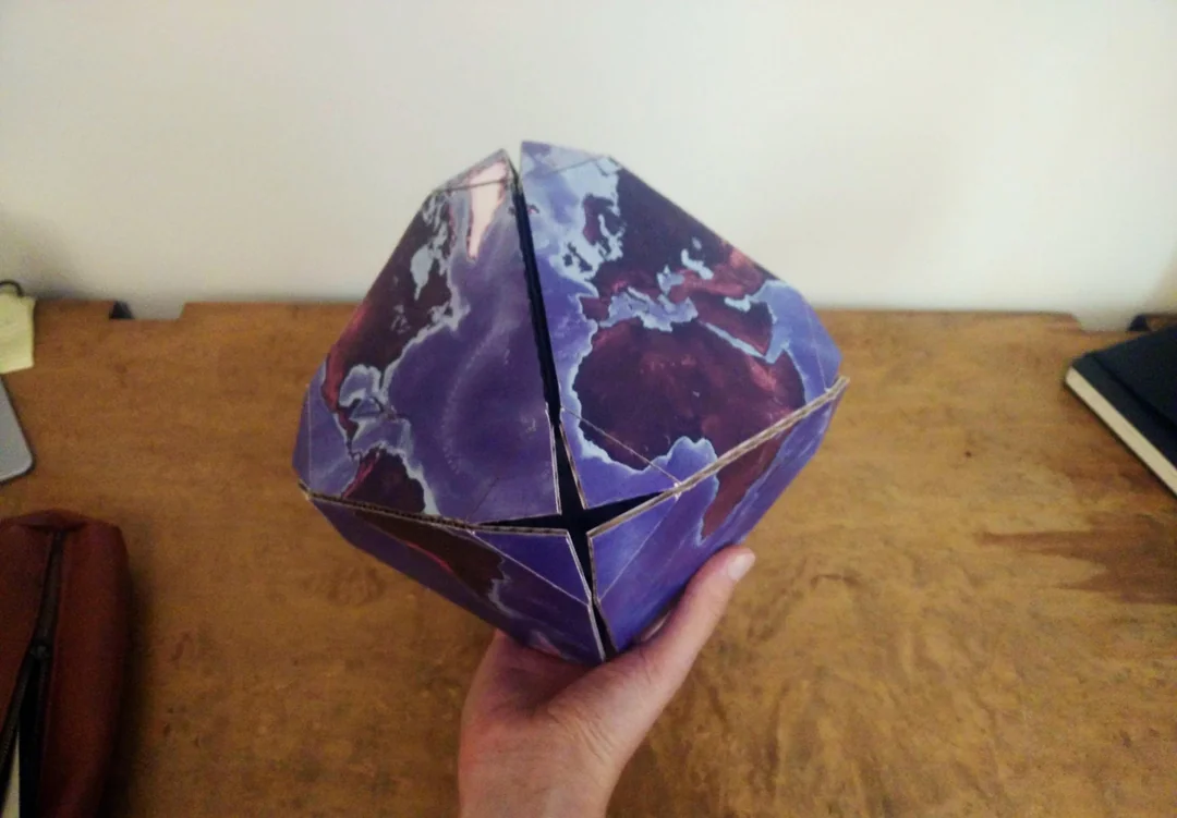
To start, take two pyramids, join their bases together, and chop their corners off. This results in a 14-sided shape called a truncated octahedron with 8 hexagonal faces and 6 square faces. This shape is special because it has perfectly flat faces while still being very “round” and sphere-like.
Next, project each point from a sphere (the Earth, in this case) onto the closest corresponding point on the truncated octahedron. Because truncated octahedrons are so sphere-like, each point only moves a little bit, resulting in only a small amount of projection distortion. Finally, cut a few specific edges to unfold the truncated octahedron into a flat 2D shape, and voilà! You now have a Waterman map.
Conclusion
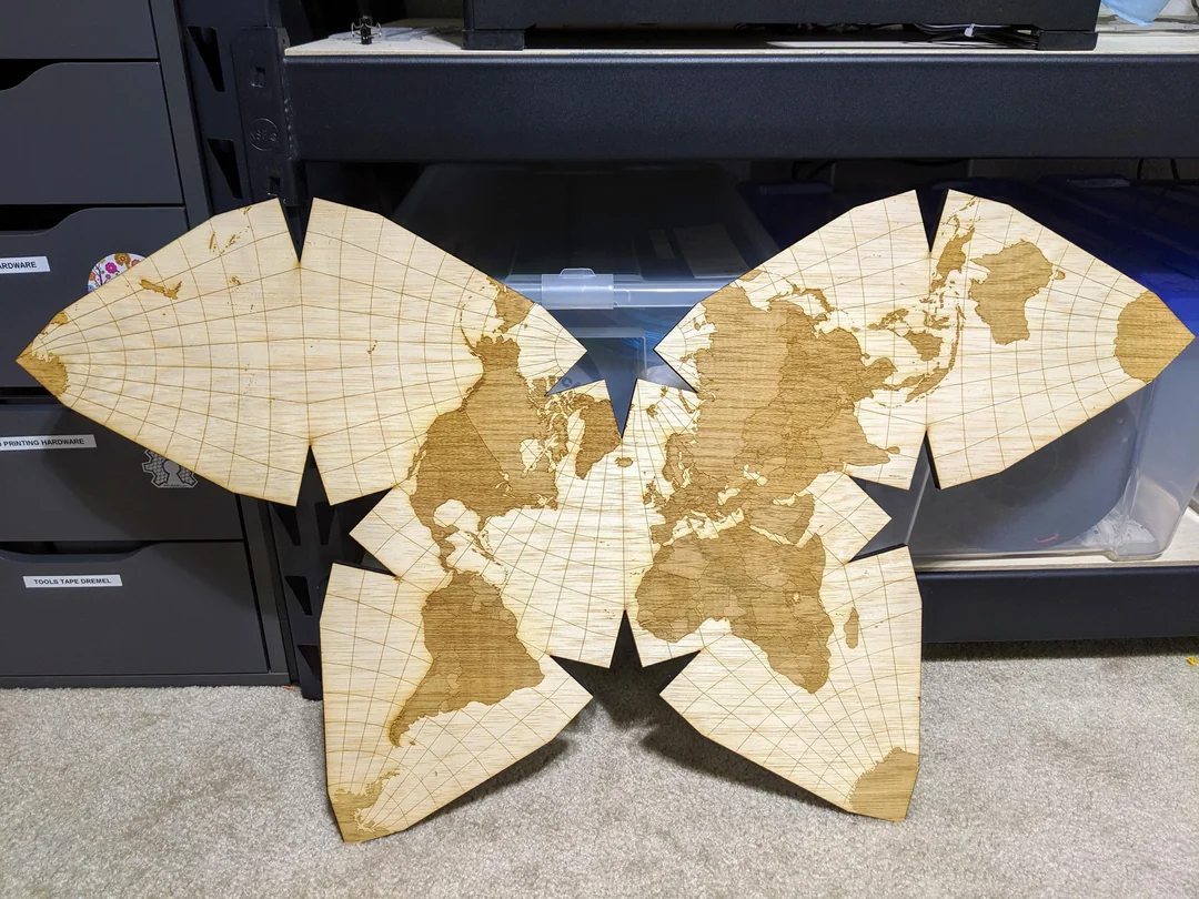
I love the Waterman butterfly. I think that it is genuinely one of the best map projections, and I wish it was used more.
One major obstacle to the Waterman being more widely used is that it’s difficult to find print-quality images. Over the last few years, several of the websites that used to host ultra-resolution images of Waterman maps have shut down. Thankfully, I had the accidental foresight to save a couple Waterman maps to my hard drive a few years ago.
Unfortunately, because the images are so heavy (one weighs 117.8 megabytes, which is heavier than all other assets on my site put together), I can’t host them on this site. So if you want them, feel free to get in touch and I’ll send them to you!
~Ethan